How to add different props to the dropdown in Bootstrap VueJS?
December 07, 2022Hi Friends 👋,
Welcome To SortoutCode! ❤️
To add different props to the dropdown using BootstrapVue.We are using the b-button component for buttons and for different props we are taking all other props examples in BootstrapVue.
Today I am going to show you How you add different props of the dropdown using BootstrapVue in VueJS?
Table of contains
- Setup the Vue.js
- Install the Bootstrap and BootstrapVue
- Create FirstComponent.vue and import it into App.js
- Different props example
Let’s start today’s tutorial How do I add different props of the dropdown using BootstrapVue in VueJS?
Setup the Vue.js
First, we have to install the Vue project, I had installed the vueJS in my system. If you haven’t installed or have any problem with installation you can follow this article, which will show you step by step process of installation.
How to Install the VueJS project?
Install the Bootstrap and BootstrapVue
First, we have to install the Vue project, I had installed the vueJS in my system. If you haven’t installed or have any problem with installation you can follow this article, which will show you step by step process of installation. In that article, I had also show you how to install BootstrapVue in your vue.js project step by step.
How to install or configure vue-bootstrap in VueJS?
Create FirstComponent.vue and import it into App.js
Create the new component in the src/components/ components folder. the component name is FirstComponent.vue and imported into the App.js file:
App.js
<template>
  <div id="app">
    <FirstComponent />
  </div>
</template>

<script>
import FirstComponent from "./components/FirstComponent.vue";
export default {
  name: "App",
  components: {
    FirstComponent,
  },
};
</script>
Different props example
Let’s take the example of all other props:
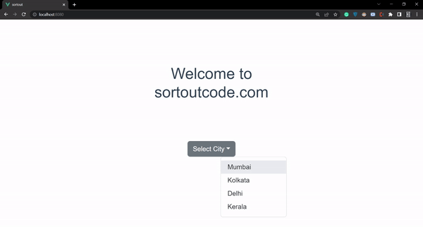
1. Add simple dropdown
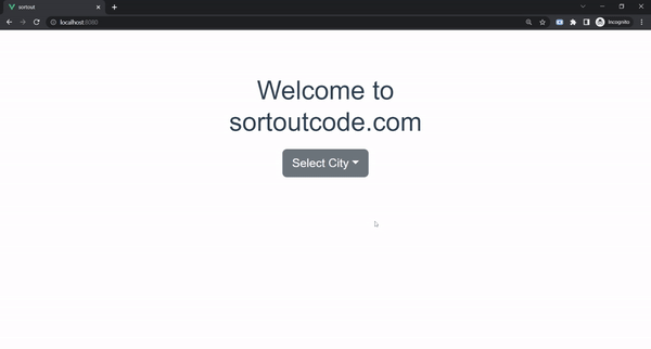
For adding the dropdown we are using the BootstrapVue b-dropdown component.<b-dropdown> components are toggleable, contextual overlays for displaying the links. This button is toggled by clicking or pressing space or enter when focused. And the <b-dropdown-item> sub-component will show the action items that provide click, link functionality. This will work as a <a> tag. In short, Renders is an <a> element by default. Let’s see the code example:
FirstComponent.js
<template>
  <div>
    <b-container fluid>
      <b-row>
        <b-col md="6" offset-md="3">
          <h1>Welcome to sortoutcode.com</h1>
          <b-dropdown id="dropdown-1" text="Select City" class="m-md-2">
            <b-dropdown-item>Mumbai</b-dropdown-item>
            <b-dropdown-item>Kolkata</b-dropdown-item>
            <b-dropdown-item>Delhi</b-dropdown-item>
          </b-dropdown>
        </b-col>
      </b-row>
    </b-container>
  </div>

</template>
<script>
export default {
  name: "FirstComponent",
};
</script>
Let’s check the output.
2. Add divider in dropdown item
And for the divide the dropdown’s item we are going to use the <b-dropdown-divider> sub-component. Which use as a divider/spacer which can be used to separate dropdown items. Let’s see the code example:
FirstComponent.js
<template>
  <div>
    <b-container fluid>
      <b-row>
        <b-col md="6" offset-md="3">
          <h1>Welcome to sortoutcode.com</h1>
          <b-dropdown id="dropdown-1" text="Select City" class="m-md-2">
            <b-dropdown-item>Mumbai</b-dropdown-item>
            <b-dropdown-item>Kolkata</b-dropdown-item>
            <b-dropdown-item>Delhi</b-dropdown-item>
            <b-dropdown-divider></b-dropdown-divider>
            <b-dropdown-item>Kerala</b-dropdown-item>
          </b-dropdown>
        </b-col>
      </b-row>
    </b-container>
  </div>

</template>
<script>
export default {
  name: "FirstComponent",
};
</script>
Let’s check the output.
3. Show active dropdown item
And to show the active drop-down item we are using the active props in BootstrapVue.Let’s see the code example:
FirstComponent.js
<template>
  <div>
    <b-container fluid>
      <b-row>
        <b-col md="6" offset-md="3">
          <h1>Welcome to sortoutcode.com</h1>
          <b-dropdown id="dropdown-1" text="Select City" class="m-md-2">
            <b-dropdown-item>Mumbai</b-dropdown-item>
            <b-dropdown-item>Kolkata</b-dropdown-item>
            <b-dropdown-item active>Delhi</b-dropdown-item>
            <b-dropdown-item>Kerala</b-dropdown-item>
          </b-dropdown>
        </b-col>
      </b-row>
    </b-container>
  </div>

</template>
<script>
export default {
  name: "FirstComponent",
};
</script>
Let’s check the output.

4. Show disabled dropdown item
And to show the disabled dropdown item we are using the disabled props in BootstrapVue.Let’s see the code example:
FirstComponent.js
<template>
  <div>
    <b-container fluid>
      <b-row>
        <b-col md="6" offset-md="3">
          <h1>Welcome to sortoutcode.com</h1>
          <b-dropdown id="dropdown-1" text="Select City" class="m-md-2">
            <b-dropdown-item>Mumbai</b-dropdown-item>
            <b-dropdown-item>Kolkata</b-dropdown-item>
            <b-dropdown-item disabled>Delhi</b-dropdown-item>
            <b-dropdown-item>Kerala</b-dropdown-item>
          </b-dropdown>
        </b-col>
      </b-row>
    </b-container>
  </div>

</template>
<script>
export default {
  name: "FirstComponent",
};
</script>
Let’s check the output.
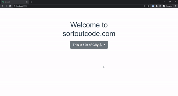
5. Add button content in the dropdown
And to add the content to the dropdown button we are going to use the button-content in BootstrapVue.button-content slot allows us to add the basic HTML tag with the icon in the button content. Let’s see the code example:
FirstComponent.js
<template>
  <div>
    <b-container fluid>
      <b-row>
        <b-col md="6" offset-md="3">
          <h1>Welcome to sortoutcode.com</h1>
          <b-dropdown id="dropdown-1" class="m-md-2">
            <template #button-content>
              This is <i>List</i> of <b>City</b>
              <b-icon-arrow-down></b-icon-arrow-down>
            </template>
            <b-dropdown-item>Mumbai</b-dropdown-item>
            <b-dropdown-item>Kolkata</b-dropdown-item>
            <b-dropdown-item disabled>Delhi</b-dropdown-item>
            <b-dropdown-item>Kerala</b-dropdown-item>
          </b-dropdown>
        </b-col>
      </b-row>
    </b-container>
  </div>

</template>
<script>
export default {
  name: "FirstComponent",
};
</script>
Let’s check the output.
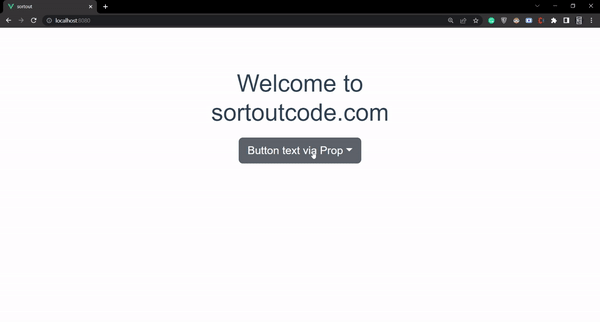
6. Add text props in the dropdown
And to add the content to the dropdown button we are going to use the text in BootstrapVue.text slot allows us to add the basic HTML tag with the icon in the button content. Let’s see the code example:
FirstComponent.js
<template>
  <div>
    <b-container fluid>
      <b-row>
        <b-col md="6" offset-md="3">
          <h1>Welcome to sortoutcode.com</h1>
          <b-dropdown text="Button text via Prop" class="m-md-2">
            <b-dropdown-item>Mumbai</b-dropdown-item>
            <b-dropdown-item>Kolkata</b-dropdown-item>
            <b-dropdown-item disabled>Delhi</b-dropdown-item>
            <b-dropdown-item>Kerala</b-dropdown-item>
          </b-dropdown>
        </b-col>
      </b-row>
    </b-container>
  </div>

</template>
<script>
export default {
  name: "FirstComponent",
};
</script>
Let’s check the output.
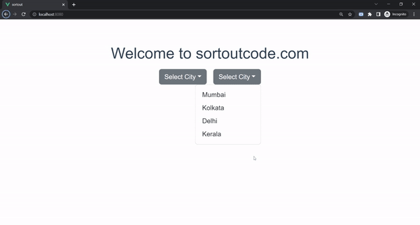
7. Dropdown menu left and right align
And to alight the dropdown menu we are using the left and right props. The dropdown menu can either be left aligned (default) or right aligned concerning the button above it. To have the dropdown aligned on the right, we are using the right props. Let’s see the code example:
FirstComponent.js
<template>
  <div>
    <b-container fluid>
      <b-row>
        <b-col md="6" offset-md="3">
          <h1>Welcome to sortoutcode.com</h1>
          <b-dropdown text="Select City" left class="m-md-2">
            <b-dropdown-item>Mumbai</b-dropdown-item>
            <b-dropdown-item>Kolkata</b-dropdown-item>
            <b-dropdown-item>Delhi</b-dropdown-item>
            <b-dropdown-item>Kerala</b-dropdown-item>
          </b-dropdown>

          <b-dropdown text="Select City" right class="m-md-2">
            <b-dropdown-item>Mumbai</b-dropdown-item>
            <b-dropdown-item>Kolkata</b-dropdown-item>
            <b-dropdown-item>Delhi</b-dropdown-item>
            <b-dropdown-item>Kerala</b-dropdown-item>
          </b-dropdown>
        </b-col>
      </b-row>
    </b-container>
  </div>

</template>
<script>
export default {
  name: "FirstComponent",
};
</script>
Let’s check the output.
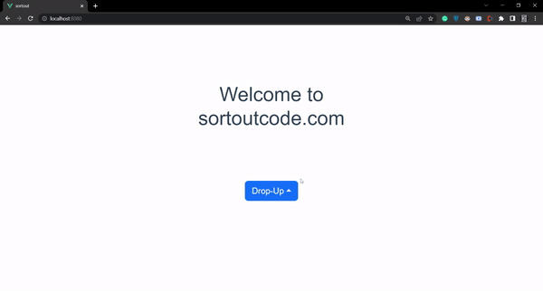
8. Add drop-up menu
And to turn the dropdown menu into drop-up menus we are going to use the dropup props of BootstrapVue.Let’s see the code example:
FirstComponent.js
<template>
  <div>
    <b-container fluid>
      <b-row>
        <b-col md="6" offset-md="3">
          <h1 class="m-5">Welcome to sortoutcode.com</h1>
          <b-dropdown id="dropdown-dropup" dropup text="Drop-Up" variant="primary" class="m-5">
            <b-dropdown-item>Mumbai</b-dropdown-item>
            <b-dropdown-item>Kolkata</b-dropdown-item>
            <b-dropdown-item>Delhi</b-dropdown-item>
            <b-dropdown-item>Kerala</b-dropdown-item>
          </b-dropdown>
        </b-col>
      </b-row>
    </b-container>
  </div>

</template>
<script>
export default {
  name: "FirstComponent",
};
</script>
For now, let’s check the output.
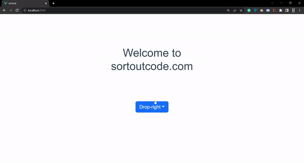
9. Add drop-right menu
And to turn dropdown menu into drop-right menus we are going to use the dropright props of BootstrapVue.Let’s see the code example:
FirstComponent.js
<template>
  <div>
    <b-container fluid>
      <b-row>
        <b-col md="6" offset-md="3">
          <h1 class="m-5">Welcome to sortoutcode.com</h1>
          <b-dropdown id="dropdown-dropright" dropright text="Drop-right" variant="primary" class="m-5">
            <b-dropdown-item>Mumbai</b-dropdown-item>
            <b-dropdown-item>Kolkata</b-dropdown-item>
            <b-dropdown-item>Delhi</b-dropdown-item>
            <b-dropdown-item>Kerala</b-dropdown-item>
          </b-dropdown>
        </b-col>
      </b-row>
    </b-container>
  </div>

</template>
<script>
export default {
  name: "FirstComponent",
};
</script>
For now, let’s check the output.
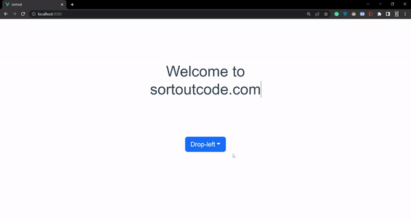
10. Add drop-left menu
And to turn the dropdown menu into drop-left menus we are going to use the dropleft props of BootstrapVue.Let’s see the code example:
FirstComponent.js
<template>
  <div>
    <b-container fluid>
      <b-row>
        <b-col md="6" offset-md="3">
          <h1 class="m-5">Welcome to sortoutcode.com</h1>
          <b-dropdown id="dropdown-dropleft" dropleft text="Drop-left" variant="primary" class="m-5">
            <b-dropdown-item>Mumbai</b-dropdown-item>
            <b-dropdown-item>Kolkata</b-dropdown-item>
            <b-dropdown-item>Delhi</b-dropdown-item>
            <b-dropdown-item>Kerala</b-dropdown-item>
          </b-dropdown>
        </b-col>
      </b-row>
    </b-container>
  </div>

</template>
<script>
export default {
  name: "FirstComponent",
};
</script>
For now, let’s check the output.
11. Add offset the dropdown
And to show the dropdown menu’s list offset from the button a bit. For that, we going to use the offset props of BootstrapVue.Let’s see the code example:
FirstComponent.js
<template>
  <div>
    <b-container fluid>
      <b-row>
        <b-col md="6" offset-md="3">
          <h1 class="m-5">Welcome to sortoutcode.com</h1>
          <b-dropdown id="dropdown-dropleft" offset="50" text="Select City" class="m-5">
            <b-dropdown-item>Mumbai</b-dropdown-item>
            <b-dropdown-item>Kolkata</b-dropdown-item>
            <b-dropdown-item>Delhi</b-dropdown-item>
            <b-dropdown-item>Kerala</b-dropdown-item>
          </b-dropdown>
        </b-col>
      </b-row>
    </b-container>
  </div>

</template>
<script>
export default {
  name: "FirstComponent",
};
</script>
For now, let’s check the output.
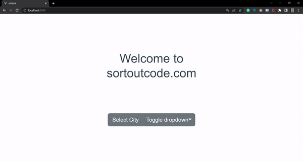
12. Add split prop to the dropdown
And to split the dropdown menus button we are going to use the split prop. The split button left side will provide the button with a standard click event and the Left side will provide a dropdown toggle button. Let’s see the code example:
FirstComponent.js
<template>
  <div>
    <b-container fluid>
      <b-row>
        <b-col md="6" offset-md="3">
          <h1 class="m-5">Welcome to sortoutcode.com</h1>
          <b-dropdown split id="dropdown-dropleft" offset="50" text="Select City" class="m-5">
            <b-dropdown-item>Mumbai</b-dropdown-item>
            <b-dropdown-item>Kolkata</b-dropdown-item>
            <b-dropdown-item>Delhi</b-dropdown-item>
            <b-dropdown-item>Kerala</b-dropdown-item>
          </b-dropdown>
        </b-col>
      </b-row>
    </b-container>
  </div>

</template>
<script>
export default {
  name: "FirstComponent",
};
</script>
For now, let’s check the output.
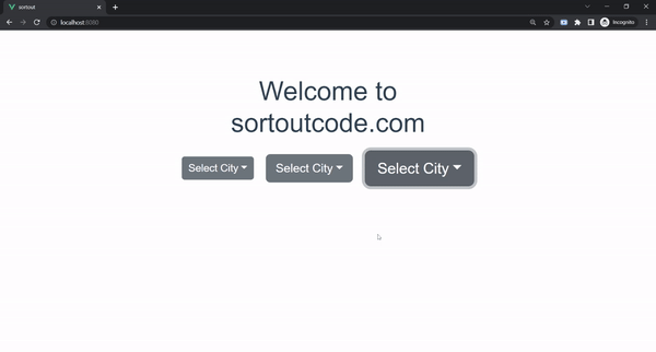
13. Add dropdown button size
And to add the different dropdown button sizes. we are using the size props and the value of props are sm,md,lg.Let’s see the code example:
FirstComponent.js
<template>
  <div>
    <b-container fluid>
      <b-row>
        <b-col md="6" offset-md="3">
          <h1>Welcome to sortoutcode.com</h1>
          <b-dropdown size="sm" id="dropdown-1" text="Select City" class="m-md-2">
            <b-dropdown-item>Mumbai</b-dropdown-item>
            <b-dropdown-item>Kolkata</b-dropdown-item>
            <b-dropdown-item>Delhi</b-dropdown-item>
          </b-dropdown>

          <b-dropdown size="md" id="dropdown-1" text="Select City" class="m-md-2">
            <b-dropdown-item>Mumbai</b-dropdown-item>
            <b-dropdown-item>Kolkata</b-dropdown-item>
            <b-dropdown-item>Delhi</b-dropdown-item>
          </b-dropdown>

          <b-dropdown size="lg" id="dropdown-1" text="Select City" class="m-md-2">
            <b-dropdown-item>Mumbai</b-dropdown-item>
            <b-dropdown-item>Kolkata</b-dropdown-item>
            <b-dropdown-item>Delhi</b-dropdown-item>
          </b-dropdown>
        </b-col>
      </b-row>
    </b-container>
  </div>

</template>
<script>
export default {
  name: "FirstComponent",
};
</script>
For now, let’s check the output.
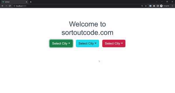
14. Add dropdown color variant
And to add the different dropdown color variants. we are using the variant props and its value is success, primary, info, danger, link, outline-dark etc. for the dropdown color variant in BootstrapVue. And the default variant color is secondary.Let’s see the code example:
FirstComponent.js
<template>
  <div>
    <b-container fluid>
      <b-row>
        <b-col md="6" offset-md="3">
          <h1>Welcome to sortoutcode.com</h1>
          <b-dropdown variant="success" id="dropdown-1" text="Select City" class="m-md-2">
            <b-dropdown-item>Mumbai</b-dropdown-item>
            <b-dropdown-item>Kolkata</b-dropdown-item>
            <b-dropdown-item>Delhi</b-dropdown-item>
          </b-dropdown>

          <b-dropdown variant="info" id="dropdown-1" text="Select City" class="m-md-2">
            <b-dropdown-item>Mumbai</b-dropdown-item>
            <b-dropdown-item>Kolkata</b-dropdown-item>
            <b-dropdown-item>Delhi</b-dropdown-item>
          </b-dropdown>

          <b-dropdown variant="danger" id="dropdown-1" text="Select City" class="m-md-2">
            <b-dropdown-item>Mumbai</b-dropdown-item>
            <b-dropdown-item>Kolkata</b-dropdown-item>
            <b-dropdown-item>Delhi</b-dropdown-item>
          </b-dropdown>
        </b-col>
      </b-row>
    </b-container>
  </div>

</template>
<script>
export default {
  name: "FirstComponent",
};
</script>
For now, let’s check the output.
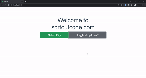
15. Add block level split dropdown button
And to add the block level split dropdown button. By default the dropdown act like an inline dropdown button. To create, the block-level split dropdown button we are using the block props. Let’s see the code example:
FirstComponent.js
<template>
  <div>
    <b-container fluid>
      <b-row>
        <b-col md="6" offset-md="3">
          <h1>Welcome to sortoutcode.com</h1>
          <b-dropdown block split split-variant="success" id="dropdown-1" text="Select City" class="m-md-2">
            <b-dropdown-item>Mumbai</b-dropdown-item>
            <b-dropdown-item>Kolkata</b-dropdown-item>
            <b-dropdown-item>Delhi</b-dropdown-item>
          </b-dropdown>
        </b-col>
      </b-row>
    </b-container>
  </div>

</template>
<script>
export default {
  name: "FirstComponent",
};
</script>
For now, let’s check the output.
All the best 👍.