How to show invalid feedback with form group component in Bootstrap VueJS?
February 10, 2023Hi Friends 👋,
Welcome To SortoutCode! ❤️
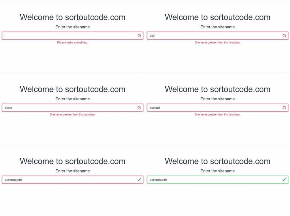
To show invalid feedback with form group component using BootstrapVue.We are going to use the invalid-feedback props to show the invalid feedback.
Today I am going to show you How you show invalid feedback with form group component using BootstrapVue in VueJS?
Table of contains
- Setup the Vue.js
- Install the Bootstrap and BootstrapVue
- Create FirstComponent.vue and import it into App.js
- Show invalid feedback
Let’s start today’s tutorial How do I show invalid feedback with form group component using BootstrapVue in VueJS?
Setup the Vue.js
First, we have to install the Vue project, I had installed the vueJS in my system. If you haven’t installed or have any problem with installation you can follow this article, which will show you step by step process of installation.
How to Install the VueJS project?
Install the Bootstrap and BootstrapVue
First, we have to install the Vue project, I had installed the vueJS in my system. If you haven’t installed or have any problem with installation you can follow this article, which will show you step by step process of installation. In that article, I had also show you how to install BootstrapVue in your vue.js project step by step.
How to install or configure vue-bootstrap in VueJS?
Create FirstComponent.vue and import it into App.js
Create the new component in the src/components/ components folder. the component name is FirstComponent.vue and imported into the App.js file:
App.js
<template>
  <div id="app">
    <FirstComponent />
  </div>
</template>

<script>
import FirstComponent from "./components/FirstComponent.vue";
export default {
  name: "App",
  components: {
    FirstComponent,
  },
};
</script>
Show invalid feedback
For work with the form, we are going to use the <b-form> component in BootstrapVue.To add some structure to forms we are using the <b-form-group> component. To pair the form control, with a legend or label.
We are using the state prop of the form group component in BootstrapVue.Bootstrap includes validation styles for valid and invalid states on most form controls. If we want to use the state particular state for a specific type of feedback.
falsedenotes the invalid state. This is great when we want to block or show the required field A user must fill in this field properly to submit the form.truedenotes the valid state. This is ideal for situations when you have per-field validation throughout a form and want to encourage a user through the rest of the fields.nullDisplays no validation state neither valid nor invalid
To show the invalid feedback we are going to use the invalid-feedback props in the form group component. Let’s see the code example:
FirstComponent.js
<template>
  <b-container fluid>
    <b-row>
      <b-col md="6" offset-md="3">
        <h1>Welcome to sortoutcode.com</h1>
        <b-form-group label="Enter the sitename" label-size="lg" :invalid-feedback="invalidFeedback" :state="state">
          <b-form-input v-model="sitename" :state="state" trim></b-form-input>
        </b-form-group>
      </b-col>
    </b-row>
  </b-container>
</template>
<script>
export default {
  name: "FirstComponent",
  computed: {
    state() {
      return this.sitename.length >= 11;
    },
    invalidFeedback() {
      if (this.sitename.length > 0) {
        return 'Sitename greater then 6 characters.'
      }
      return 'Please enter something.'
    }
  },
  data() {
    return {
      sitename: '',
    }
  },
};
</script>
For now, let’s check the output.

All the best 👍.