How to align the image in the card in Bootstrap VueJS?
October 04, 2022Hi Friends 👋,
Welcome To SortoutCode! ❤️
To align the image in the card using BootstrapVue in VueJS.We are using the no-body props to disable the card body section in BootstrapVue.
Today I am going to show you How you align the image in the card using BootstrapVue in VueJS?
Table of contains
- Setup the Vue.js
- Install the Bootstrap and BootstrapVue
- Create FirstComponent.vue and import it into App.js
- Create Card With
<b-card> - Disable the
<b-card-body>section - Align the image
Let’s start today’s tutorial How do I align the image in the card using the BootstrapVue in VueJS?
Setup the Vue.js
First, we have to install the Vue project, I had installed the vueJS in my system. If you haven’t installed or have any problem with installation you can follow this article, which will show you step by step process of installation.
How to Install the VueJS project?
Install the Bootstrap and BootstrapVue
First, we have to install the Vue project, I had installed the vueJS in my system. If you haven’t installed or have any problem with installation you can follow this article, which will show you step by step process of installation. In that article, I had also show you how to install BootstrapVue in your vue.js project step by step.
How to install or configure vue-bootstrap in VueJS?
Create FirstComponent.vue and import it into App.js
Create the new component into src/components/ components folder.the component name is FirstComponent.vue and import into App.js file:
App.js
<template>
  <div id="app">
    <FirstComponent />
  </div>
</template>

<script>
import FirstComponent from "./components/FirstComponent.vue";
export default {
  name: "App",
  components: {
    FirstComponent,
  },
};
</script>

<style>
#app {
  font-family: Avenir, Helvetica, Arial, sans-serif;
  -webkit-font-smoothing: antialiased;
  -moz-osx-font-smoothing: grayscale;
  text-align: center;
  color: #2c3e50;
  margin-top: 60px;
}
</style>
Create Card With <b-card>
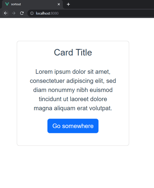
In BootstrapVue we are using the <b-card> to create the card. Cards support a wide variety of content, including images, text, list groups, links, and more. Let’s see the example of a card.
<template>
  <div class="hello">
    <b-container>
      <b-row>
        <b-col md="4">
          <div>
            <b-card title="Card Title">
              <b-card-body>
                <b-card-text>
                Lorem ipsum dolor sit amet, consectetuer adipiscing elit, sed diam nonummy nibh euismod tincidunt ut laoreet dolore magna aliquam erat volutpat.
              </b-card-text>
              <b-button href="#" variant="primary">Go somewhere</b-button>
              </b-card-body>
            </b-card>
          </div>
        </b-col>
      </b-row>
    </b-container>
  </div>
</template>

<script>
export default {
  name: "FirstComponent",
};
</script>
Output
Align the image
We are align the image using the img-top,img-bottom,img-left,img-right these props.
let’s see the example of img-top props:
<template>
  <div class="hello">
    <b-container>
      <b-row>
        <b-col md="8">
          <div>
            <h4>Image Align Top</h4>
            <b-card-group deck>
              <b-card img-src="https://placekitten.com/1000/300" img-alt="Card image" img-top>
                <b-card-text>
                  Some quick example text to build on the card and make up the bulk of the card's content.
                </b-card-text>
              </b-card>
            </b-card-group>
          </div>

        </b-col>
      </b-row>
    </b-container>
  </div>
</template>

<script>
export default {
  name: "FirstComponent",
};
</script>
Output
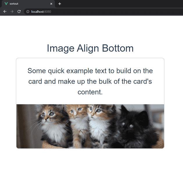
let’s see the example of img-bottom props:
<template>
  <div class="hello">
    <b-container>
      <b-row>
        <b-col md="8">
          <div>
            <h4>Image Align Bottom</h4>
            <b-card-group deck>
              <b-card img-src="https://placekitten.com/1000/300" img-alt="Card image" img-bottom>
                <b-card-text>
                  Some quick example text to build on the card and make up the bulk of the card's content.
                </b-card-text>
              </b-card>
            </b-card-group>
          </div>

        </b-col>
      </b-row>
    </b-container>
  </div>
</template>

<script>
export default {
  name: "FirstComponent",
};
</script>
Output
let’s see the example of img-left props:
<template>
  <div class="hello">
      <b-contaimer>
        <b-row>
          <b-col cols="8">
            <div class="mt-4">
              <h4>Align Image Left</h4>
              <b-card img-src="https://placekitten.com/300/300" img-alt="Card image" img-left class="mb-3">
                <b-card-text>
                  Some quick example text to build on the card and make up the bulk of the card's content.
                </b-card-text>
              </b-card>
            </div>
          </b-col>
        </b-row>
      </b-contaimer>
    </div>
</template>

<script>
export default {
  name: "FirstComponent",
};
</script>
Output
let’s see the example of img-right props:
<template>
  <div class="hello">
      <b-contaimer>
        <b-row>
          <b-col cols="8">
            <div class="mt-4">
              <h4>Align Image Right</h4>
              <b-card img-src="https://placekitten.com/300/300" img-alt="Card image" img-right class="mb-3">
                <b-card-text>
                  Some quick example text to build on the card and make up the bulk of the card's content.
                </b-card-text>
              </b-card>
            </div>
          </b-col>
        </b-row>
      </b-contaimer>
    </div>
</template>

<script>
export default {
  name: "FirstComponent",
};
</script>
Output
All the best 👍.


