How to add inline multiple button style checkbox in Bootstrap VueJS?
December 26, 2022Hi Friends 👋,
Welcome To SortoutCode! ❤️
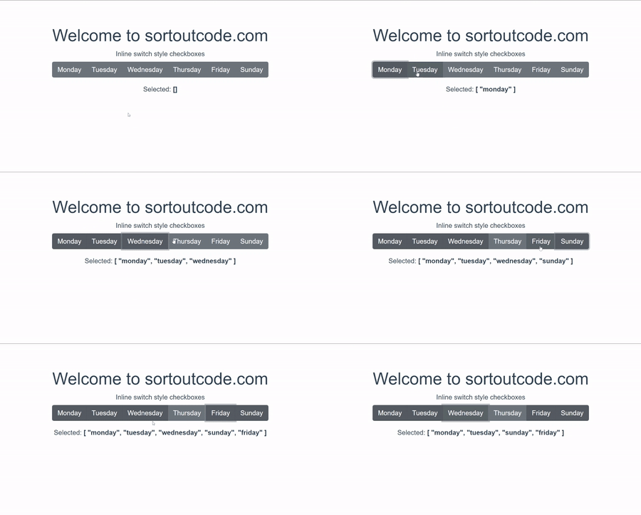
To add inline multiple button style checkbox using BootstrapVue.We are going to use the b-form-checkbox component to show the checkbox. To add multiple button style checkboxes we are going to use the button props with an options array of options for multiple checkboxes. And to inline the multiple button checkbox we are going to use inline props with an options array.
Today I am going to show you How you add inline multiple button style checkboxes using BootstrapVue in VueJS?
Table of contains
- Setup the Vue.js
- Install the Bootstrap and BootstrapVue
- Create FirstComponent.vue and import it into App.js
- Add inline multiple button style checkbox
Let’s start today’s tutorial How do I add an inline multiple button style checkbox using BootstrapVue in VueJS?
Setup the Vue.js
First, we have to install the Vue project, I had installed the vueJS in my system. If you haven’t installed or have any problem with installation you can follow this article, which will show you step by step process of installation.
How to Install the VueJS project?
Install the Bootstrap and BootstrapVue
First, we have to install the Vue project, I had installed the vueJS in my system. If you haven’t installed or have any problem with installation you can follow this article, which will show you step by step process of installation. In that article, I had also show you how to install BootstrapVue in your vue.js project step by step.
How to install or configure vue-bootstrap in VueJS?
Create FirstComponent.vue and import it into App.js
Create the new component in the src/components/ components folder. the component name is FirstComponent.vue and imported into the App.js file:
App.js
<template>
  <div id="app">
    <FirstComponent />
  </div>
</template>

<script>
import FirstComponent from "./components/FirstComponent.vue";
export default {
  name: "App",
  components: {
    FirstComponent,
  },
};
</script>
Add inline multiple button style checkbox
To add the checkbox we are going to use the form checkbox <b-form-checkbox> component. these components <b-form-checkbox-group> and <b-form-checkbox> use the bootstrap custom checkbox input to replace the browser default checkbox input.so it is a solid replacement for the default checkbox input.
To add multiple button style checkboxes we are going to use the button props with an options array of options for multiple checkboxes. And to add inline the multiple button checkboxes we are going to use inline props with an options array. Let’s see the code example:
FirstComponent.js
<template>
  <div>
  <h1>Welcome to sortoutcode.com</h1>
    <b-form-group
      label="Inline switch style checkboxes"
      v-slot="{ ariaDescribedby }"
    >
      <b-form-checkbox-group
        v-model="selected"
        :options="options"
        :aria-describedby="ariaDescribedby"
        buttons
        inline
      ></b-form-checkbox-group>
    </b-form-group>
    <div>Selected: <strong>{{ selected }}</strong></div>
  </div>
</template>
<script>
  export default {
    data() {
      return {
        selected: [],
        options: [
          { text: 'Monday', value: 'monday' },
          { text: 'Tuesday', value: 'tuesday' },
          { text: 'Wednesday', value: 'wednesday' },
          { text: 'Thursday', value: 'thursday' },
          { text: 'Friday', value: 'friday' },
          { text: 'Sunday', value: 'sunday' }
        ]
      }
    }
  }
</script>
For now, let’s check the output.

All the best 👍.