How to add Different props to the item of listing in Bootstrap VueJS?
September 16, 2022Hi Friends 👋,
Welcome To SortoutCode! ❤️
To add Different props to the item of the list using BootstrapVue in VueJS.We are using the <b-list-group> to create the list
in BootstrapVue.
Today I am going to show you How do you add Different props to the item of the list using the BootstrapVue in VueJS.
Table of contains
- Setup the Vue.js
- Install the Bootstrap and BootstrapVue
- Create FirstComponent.vue and import it into App.js
- Create the list component
- set the active item
- set disabled item from listing
- set button props to an item from listing
- Add contextual variants props for style to an item from listing
- Add the badges to items
- Add the horizontal props to items
Let’s start today’s tutorial How do I add Different props to the item of the list using the BootstrapVue in VueJS?
Setup the Vue.js
First, we have to install the Vue project, I had installed the vueJS in my system. If you haven’t installed or have any problem with installation you can follow this article, it will show you step by step process of installation.
How to Install the VueJS project?
Install the Bootstrap and BootstrapVue
First, we have to install the Vue project, I had installed the vueJS in my system. If you haven’t installed or have any problem with installation you can follow this article, it will show you step by step process of installation. In that article, I had also show you how to install BootstrapVue in your vue.js project step by step.
How to install or configure vue-bootstrap in VueJS?
Create FirstComponent.vue and import it into App.js
Create the new component into src/components/ components folder.the component name is FirstComponent.vue and import into App.js file:
App.js
<template>
  <div id="app">
    <FirstComponent />
  </div>
</template>

<script>
import FirstComponent from "./components/FirstComponent.vue";
export default {
  name: "App",
  components: {
    FirstComponent,
  },
};
</script>

<style>
#app {
  font-family: Avenir, Helvetica, Arial, sans-serif;
  -webkit-font-smoothing: antialiased;
  -moz-osx-font-smoothing: grayscale;
  text-align: center;
  color: #2c3e50;
  margin-top: 60px;
}
</style>
Create the list component
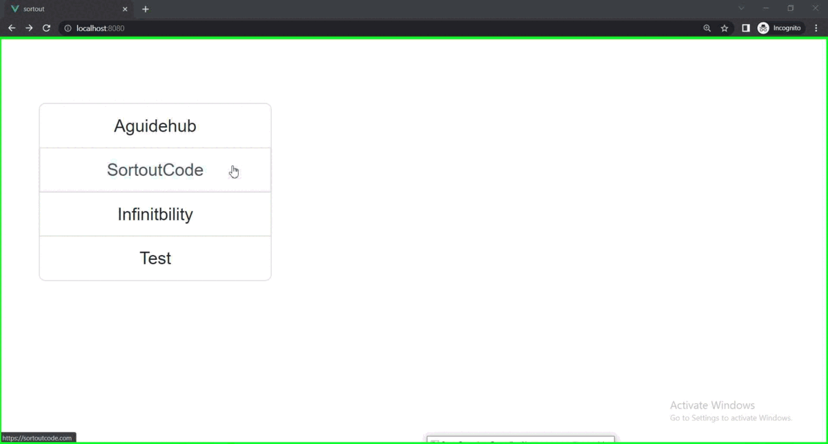
List group components are flexible and powerful for displaying the series of content. We are using the List group component to create our list in BootstrapVue.List Group items can be modified to support just about any content within.
<template>
  <div class="hello">
    <b-container>
      <b-row>
        <b-col md="4">
            <b-list-group>
                <b-list-group-item>SortoutCode</b-list-group-item>
                <b-list-group-item>Aguidehub</b-list-group-item>
                <b-list-group-item>Infinitbility</b-list-group-item>
                <b-list-group-item>Test</b-list-group-item>
            </b-list-group>
        </b-col>
      </b-row>
    </b-container>
  </div>
</template>

<script>
export default {
  name: "FirstComponent",
};
</script>
Output

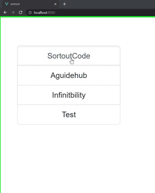
set the active item
to set the active item from the list. you have to pass the active props to the <b-list-group-item> to indicate the currently active item. let’s see the example of an active item from the listing.
<template>
  <div class="hello">
    <b-container>
      <b-row>
        <b-col md="4">
            <b-list-group>
                <b-list-group-item active>SortoutCode</b-list-group-item>
                <b-list-group-item>Aguidehub</b-list-group-item>
                <b-list-group-item>Infinitbility</b-list-group-item>
                <b-list-group-item>Test</b-list-group-item>
            </b-list-group>
        </b-col>
      </b-row>
    </b-container>
  </div>
</template>

<script>
export default {
  name: "FirstComponent",
};
</script>
Output

set disabled item from listing
To set the disabled item from the list. you have to pass the disabled props to the <b-list-group-item> to make it appear disabled item.let’s see the example of a disabled item from the listing.
<template>
  <div class="hello">
    <b-container>
      <b-row>
        <b-col md="4">
            <b-list-group>
                <b-list-group-item>SortoutCode</b-list-group-item>
                <b-list-group-item>Aguidehub</b-list-group-item>
                <b-list-group-item>Infinitbility</b-list-group-item>
                <b-list-group-item disabled>Test</b-list-group-item>
            </b-list-group>
        </b-col>
      </b-row>
    </b-container>
  </div>
</template>

<script>
export default {
  name: "FirstComponent",
};
</script>
Output

set href props item from listing
To set the actionable link to an item from the list. you have to pass the href="" props to the <b-list-group-item> to make it set the actionable link to the item of the Bootstrap listing.let’s see the example of an actionable item from the listing.
<template>
  <div class="hello">
    <b-container>
      <b-row>
        <b-col md="4">
            <b-list-group>
                <b-list-group-item href="https://sortoutcode.com/">SortoutCode</b-list-group-item>
                <b-list-group-item href="https://aguidehub.com/">Aguidehub</b-list-group-item>
                <b-list-group-item href="https://infinitbility.com/">Infinitbility</b-list-group-item>
                <b-list-group-item>Test</b-list-group-item>
            </b-list-group>
        </b-col>
      </b-row>
    </b-container>
  </div>
</template>

<script>
export default {
  name: "FirstComponent",
};
</script>
Output
set button props to an item from listing
To set the button to item from the list. you have to pass the button props to the <b-list-group-item> to make it set the clickable to the item of Bootstrap listing.let’s see the example of a button to item from listing.
<template>
  <div class="hello">
    <b-container>
      <b-row>
        <b-col md="4">
            <b-list-group>
                <b-list-group-item button>SortoutCode</b-list-group-item>
                <b-list-group-item button>Aguidehub</b-list-group-item>
                <b-list-group-item button>Infinitbility</b-list-group-item>
                <b-list-group-item>Test</b-list-group-item>
            </b-list-group>
        </b-col>
      </b-row>
    </b-container>
  </div>
</template>

<script>
export default {
  name: "FirstComponent",
};
</script>
For now, let’s check the output.
Output
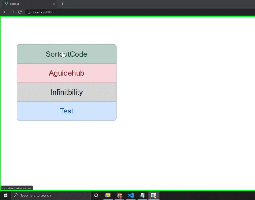
Add contextual variants props for style to item from listing
Add the contextual variants to style the item from the list. you have to pass the variant=“primary” props to the <b-list-group-item> to make it.To set contextual variants="" to style the item of Bootstrap listing. let’s see the example of variants to an item from the listing.
<template>
  <div class="hello">
    <b-container>
      <b-row>
        <b-col md="4">
            <b-list-group>
                <b-list-group-item variant="primary">SortoutCode</b-list-group-item>
                <b-list-group-item variant="secondary">Aguidehub</b-list-group-item>
                <b-list-group-item variant="success">Infinitbility</b-list-group-item>
                <b-list-group-item variant="dark">Test</b-list-group-item>
            </b-list-group>
        </b-col>
      </b-row>
    </b-container>
  </div>
</template>

<script>
export default {
  name: "FirstComponent",
};
</script>
Output

Contextual variants also work with the actional link to items of listing. In the actionable item, it shows an extra hover effect to BootstrapVue.And on the click, it set it to indicate an active selection on a contextual list group item. let’s see the example of variants to an item from the listing.
<template>
  <div class="hello">
    <b-container>
      <b-row>
        <b-col md="4">
            <b-list-group>
                <b-list-group-item href="#" variant="success">SortoutCode</b-list-group-item>
                <b-list-group-item href="#" variant="success">Aguidehub</b-list-group-item>
                <b-list-group-item href="#" variant="success">Infinitbility</b-list-group-item>
                <b-list-group-item href="#" variant="success">Test</b-list-group-item>
            </b-list-group>
        </b-col>
      </b-row>
    </b-container>
  </div>
</template>

<script>
export default {
  name: "FirstComponent",
};
</script>
Output
Add the badges to items
Add badges to any list group item to show unread counts, activity, and more with the help of some flex utility classes. let’s see the example of a button for an item from the listing.
<template>
  <div class="hello">
    <b-container>
      <b-row>
        <b-col md="4">
            <b-list-group>
             <b-list-group-item class="d-flex justify-content-between align-items-center">
    SortoutCode
    <b-badge variant="primary" pill>14</b-badge>
  </b-list-group-item>

  <b-list-group-item class="d-flex justify-content-between align-items-center">
    Aguidehub
    <b-badge variant="primary" pill>2</b-badge>
  </b-list-group-item>

  <b-list-group-item class="d-flex justify-content-between align-items-center">
    Infinitbility
    <b-badge variant="primary" pill>1</b-badge>
  </b-list-group-item>
    <b-list-group-item class="d-flex justify-content-between align-items-center">
    Test
    <b-badge variant="primary" pill>0</b-badge>
    </b-list-group-item>
  </b-list-group>
        </b-col>
      </b-row>
    </b-container>
  </div>
</template>

<script>
export default {
  name: "FirstComponent",
};
</script>
Output

Add the horizontal props to items
Add horizontal props to the items from the listing. To show the list horizontal listing of items. let’s see the example of horizontal to item from listing.
<template>
  <div class="hello">
    <b-container>
      <b-row>
        <b-col md="4">
            <b-list-group horizontal>
                <b-list-group-item>SortoutCode</b-list-group-item>
                <b-list-group-item>Aguidehub</b-list-group-item>
                <b-list-group-item>Infinitbility</b-list-group-item>
                <b-list-group-item>Test</b-list-group-item>
            </b-list-group>
        </b-col>
      </b-row>
    </b-container>
  </div>
</template>

<script>
export default {
  name: "FirstComponent",
};
</script>
Output

All the best 👍.