How to add a split button color variant in the dropdown in Bootstrap VueJS?
November 26, 2022Hi Friends 👋,
Welcome To SortoutCode! ❤️
To add a split button color variant in the dropdown using BootstrapVue.We are using the split-variant props and split-variant props values are success, primary, info, danger, link, outline dark etc. for split button color variant in the dropdown in BootstrapVue. And the default variant color is secondary`.
Today I am going to show you How you add a split button color variant in dropdown using BootstrapVue in VueJS?
Table of contains
- Setup the Vue.js
- Install the Bootstrap and BootstrapVue
- Create FirstComponent.vue and import it into App.js
- Add a split button color variant in the dropdown
Let’s start today’s tutorial How do I add a split button color variant in dropdown using BootstrapVue in VueJS?
Setup the Vue.js
First, we have to install the Vue project, I had installed the vueJS in my system. If you haven’t installed or have any problem with installation you can follow this article, which will show you step by step process of installation.
How to Install the VueJS project?
Install the Bootstrap and BootstrapVue
First, we have to install the Vue project, I had installed the vueJS in my system. If you haven’t installed or have any problem with installation you can follow this article, which will show you step by step process of installation. In that article, I had also show you how to install BootstrapVue in your vue.js project step by step.
How to install or configure vue-bootstrap in VueJS?
Create FirstComponent.vue and import it into App.js
Create the new component in the src/components/ components folder. the component name is FirstComponent.vue and imported into the App.js file:
App.js
<template>
  <div id="app">
    <FirstComponent />
  </div>
</template>

<script>
import FirstComponent from "./components/FirstComponent.vue";
export default {
  name: "App",
  components: {
    FirstComponent,
  },
};
</script>

<style>
#app {
  font-family: Avenir, Helvetica, Arial, sans-serif;
  -webkit-font-smoothing: antialiased;
  -moz-osx-font-smoothing: grayscale;
  text-align: center;
  color: #2c3e50;
  margin-top: 60px;
}
</style>
Add a split button color variant in the dropdown
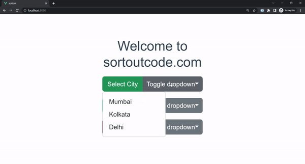
For adding dropdown button size we are using the BootstrapVue b-dropdown component.<b-dropdown> components are toggleable, contextual overlays for displaying the links. This button is toggled by clicking or pressing space or enter when focused. And the <b-dropdown-item> sub-component will show the action items that provide click, link functionality. This will work as a <a> tag. In short, Renders is an <a> element by default.
And to add the different split button color variants in the dropdown. we are using the split-variant props and its value is success, primary, info, danger, link, outline dark etc. for the split button color variant in the dropdown in BootstrapVue. And the default variant color is secondary`.Let’s see the code example:
FirstComponent.js
<template>
  <div>
    <b-container fluid>
      <b-row>
        <b-col md="6" offset-md="3">
          <h1>Welcome to sortoutcode.com</h1>
          <b-dropdown split split-variant="success" id="dropdown-1" text="Select City" class="m-md-2">
            <b-dropdown-item>Mumbai</b-dropdown-item>
            <b-dropdown-item>Kolkata</b-dropdown-item>
            <b-dropdown-item>Delhi</b-dropdown-item>
          </b-dropdown>

          <b-dropdown split split-variant="info" id="dropdown-1" text="Select City" class="m-md-2">
            <b-dropdown-item>Mumbai</b-dropdown-item>
            <b-dropdown-item>Kolkata</b-dropdown-item>
            <b-dropdown-item>Delhi</b-dropdown-item>
          </b-dropdown>

          <b-dropdown split split-variant="danger" id="dropdown-1" text="Select City" class="m-md-2">
            <b-dropdown-item>Mumbai</b-dropdown-item>
            <b-dropdown-item>Kolkata</b-dropdown-item>
            <b-dropdown-item>Delhi</b-dropdown-item>
          </b-dropdown>
        </b-col>
      </b-row>
    </b-container>
  </div>

</template>
<script>
export default {
  name: "FirstComponent",
};
</script>
For now, let’s check the output.
All the best 👍.